
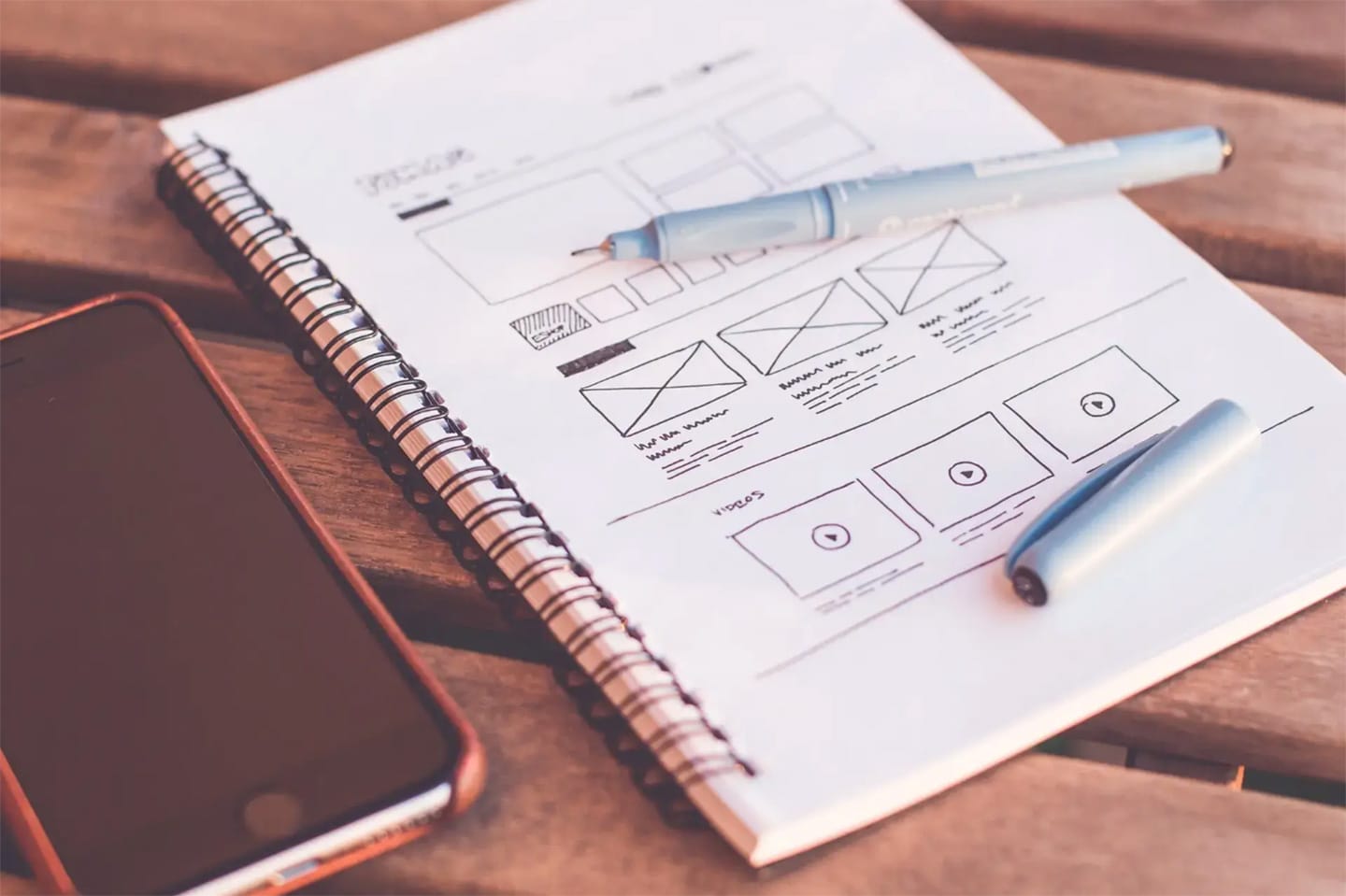
For years, the concept of "mobile first" has been emphasized in design, product development, and frontend development. However, I believe it's time to encourage critical thinking and open discussion regarding this approach. In a world where screens are growing larger instead of smaller, and where content often shines on bigger screens, it's worth considering an alternative perspective: "Desktop First (with Mobile in Mind)." This viewpoint encourages us to explore the potential benefits of prioritizing desktop experiences while still acknowledging the importance of mobile devices in today's digital landscape.
1. The Evolution of Screen Sizes:
Over time, screens have been increasing in size, with desktop monitors, laptops, and even tablets offering larger displays. This shift presents an opportunity to leverage the advantages of bigger screens, providing users with more visually engaging and immersive experiences. By considering a desktop-first approach, we can capitalize on this screen real estate to deliver content in a compelling and impactful manner.
2. Maximizing Content and Information:
Larger screens offer a distinct advantage when it comes to content consumption and information presentation. They enable the display of a greater amount of content simultaneously, allowing users to grasp the context and absorb information more efficiently. By adopting a desktop-first mindset, we can ensure that users have access to the complete breadth of content and information, while still considering mobile limitations and optimizing the experience for smaller screens.
3. Optimizing for Mobile:
While emphasizing desktop experiences, it's important to recognize the continued significance of mobile devices. Mobile optimization remains a crucial aspect of web development. With a "Desktop First (with Mobile in Mind)" approach, we can strategically plan for mobile interactions, streamline the user interface, and optimize content delivery for smaller screens. This ensures a seamless, intuitive mobile experience tailored to the unique needs of mobile users.
Conclusion:
In light of the growing screen sizes and the richness of content, it's worthwhile to question the prevailing "mobile first" design philosophy. Instead, let's encourage thoughtful consideration and the sharing of diverse perspectives. By contemplating a "Desktop First (with Mobile in Mind)" approach, we can explore the potential advantages of prioritizing desktop experiences while still recognizing the importance of mobile devices. It's time to foster open dialogue and challenge our design philosophies to adapt to the evolving digital landscape. What are your thoughts on this alternative perspective?